Estimated reading time: 5 minutes
Once you start getting enough data on your user behavior from your heatmaps, session recordings, and feedback surveys, you also start forming assumptions and hypotheses (consciously or not) about your website/webshop.
While some observations may have obvious solutions—for instance, if a session recording shows you that your page design looks broken on certain screen resolutions, it’s clear that you need to fix your responsive layout—some are not as straightforward.
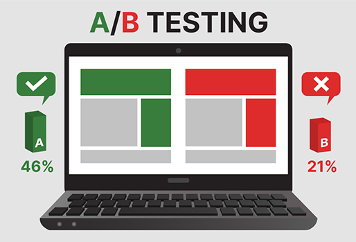
A/B testing helps you confirm your assumptions by testing different variants against a control (i.e., the original or current version of your web page) and reporting each variants’ performance in terms of the goal that you want to achieve.
There are usually two goals that you can aim for in an A/B testing project:
1. Addressing a problem.
If your heatmaps are showing you that website visitors are largely ignoring your call to action, then it’s clear that you need to change something—it’s what you need to change exactly that may not be obvious.
Do you need to change the CTA placement, or remove some elements around it to make it stand out more?
Is it just a matter of changing the color of the button to a more eye-catching one?
Or is it the text that needs to be rewritten?
Through one test of a time, you can slowly but surely weed out these options and figure out the change that you need to make to achieve more CTA button clicks (and eventually, conversions).
2. Improving an existing feature or functionality.
There might not be a critical problem showing up in your user experience analysis, but there’s always room for improvement for your “just fine” metrics as well.
It can be daunting to try changes to your website design or features especially for things that do not necessarily have an issue, but are not performing all that great either.
As they say, if it’s not broke, don’t fix it.
But you also run the risk of lagging behind your competitors if you constantly settle for things that are ‘just’ working.
A happy medium you can go for is performing an A/B test, where you can experiment with new ideas while at the same time not completely overhauling your existing structure or design.
A/B vs Split Test
A/B testing and split testing are sometimes used interchangeably, but these two terms actually refer to different types of tests that you use for two different purposes.
A/B testing is for testing similar versions of a web page with only one point of difference—for example, different colors of a button.
Split testing, on the other hand, is for testing two completely different versions of a web page with more than one variant being tested—like a redesigned landing page, or a shift in your overall website theme.
Both types of tests are useful in their own way, so you should carefully consider your goal when choosing one over the other.
If, for instance, you’re experimenting with the right approach to a landing page that will make your visitors convert, a split test will be the ideal thing to do.
You can then set up two different versions of your page—one with a playful or lighthearted tone, and another with direct to the point content.
On the other hand, if you’re looking to improve only a single element on a web page, then A/B testing is the way to go, like testing different headlines for a blog article.
A/B testing and split testing can also be used together for better results: you can first set up a split test to see which theme resonates with your users best, then when a winning variant is chosen, you can work your way down to the details by A/B testing specific elements like text and button placements, enabling you to arrive at the best possible version of your page.
Note: Most tools can handle simple A/B test setups like playing with different colors or text variations.
For split testing pages with completely different layouts, you’d likely need the help of a developer to set up these pages, and the split testing tools can handle the serving of the page variants to a sample of your website visitors.
A/B testing with Crazy Egg
At 1902 Software, we use Crazy Egg for A/B testing new ideas we want to implement on our websites.
Crazy Egg makes it easy to manage A/B tests because their algorithm largely takes care of everything after your initial set up.
Once you determine the variants that you want to test, Crazy Egg then configures how the different versions of your page are shown to your users.
Traditionally, an A/B test campaign is split evenly among your visitors, i.e., half are shown the control while the other half are shown the variant being tested.
In Crazy Egg, however, they implement “multi-armed bandit testing”, where the split test is continuously configured as it collects data and learns from preliminary results.
For example, if one variant is getting more positive results than the other, more traffic gets directed to the former, to make sure that potential conversions are not being wasted on the less successful variant.
You can read more about multi-armed bandit testing here.
