Estimated reading time: 3 minutes
This blog post was last updated on January 29, 2020. The user engagement and interaction features offered by Crazy Egg and Hotjar may have undergone changes since then. Though we strive to remain current, the accuracy of the information here is limited to the last revision date.
Heatmaps tell the visual story of how users interact and engage with a specific website page.
As its name suggests, it maps out the elements or sections of a page that get views, clicks, or movements from its visitors, using overlaid colors to indicate ‘heat’ (i.e., the most engagements) and ‘cold’ (i.e., the ones with little to no interactions).

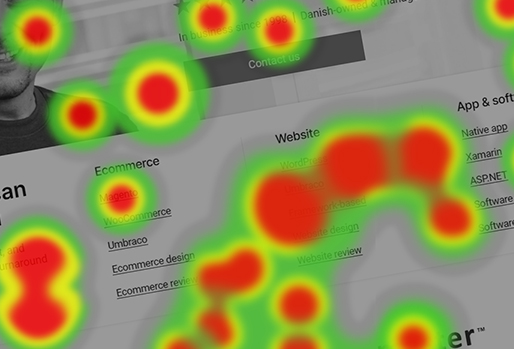
(A sample heatmap for 1902 Software’s homepage in Crazy Egg)
In Crazy Egg, for example, the brightest areas (in the meter on the left) indicate the most popular sections of the page—in this case, our “What we do” section.
You can also see splotches on some areas of the page, which show parts where we get clicks from our visitors.

(A sample heatmap (scrolls) for 1902 Software’s homepage in Hotjar)
Other tools, like Hotjar, use hot colors to represent a high intensity of user engagement and cool colors for the opposite.
Types of heatmaps
A heatmap for user engagement can mean many different things—it could be clicking or tapping, scrolling, or simply moving the mouse cursor (which often indicates pausing or reading).
To get a full understanding of how users interact with the page, there are different types of heatmaps that show these varied activities:
1. Click map – This is what’s often associated with the general “heatmap” term—a visual report that shows parts of a page that get the most clicks (or taps in mobile devices).

(A Hotjar clickmap for 1902 Software’s contact form, with the red areas representing the most clicks and the blue areas representing the least ones)
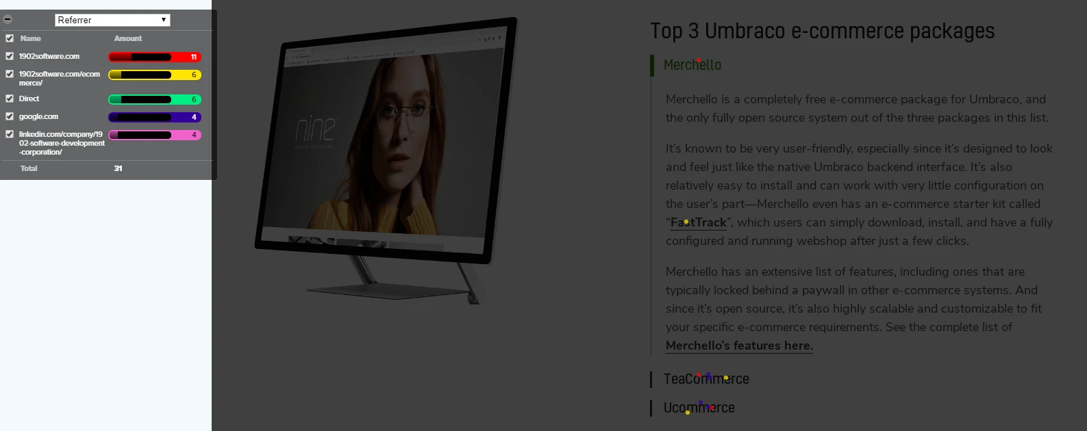
(A Crazy Egg “confetti” report—their version of a clickmap—for 1902 Software’s Umbraco ecommerce page, which not only shows the areas of the page that got clicks, but also provides a context for these clicks with additional information such as the referrer page)

(Page Analytics, Google’s analytics Chrome extension, provides a “clickmap” of a sort by adding bubbles beside clickable elements on a page showing the percentage of website visitors clicking on each specific link or element.)
2. Scroll map – This heatmap is used to indicate the popularity of a page’s sections.
Typically, you would expect a scroll map to naturally go from hot to cold—with above-the-fold content always in the hot area as it’s the part of the page that each user sees upon landing.

(A Crazy Egg scrollmap for a specific area in 1902 Software’s homepage, which interestingly indicates that the section with our clients logos is more popular than our featured content section, despite it being lower in position on the page)
3. Move map – A move map is a visual representation of how visitors move around on a page.
According to Hotjar, research suggests that the position of the cursor typically indicates where users are looking in the page.
While this is only a correlation, it still gives you a good idea on how your visitors are likely consuming your content.
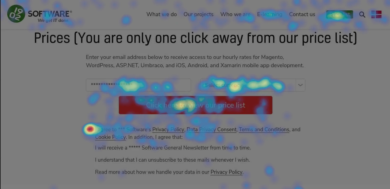
(A Hotjar move map for 1902 Software’s pricelist page, which tells us that no one likely reads through the short description above the form—a critical insight if this text happened to contain important information for clients)
What insights can you get from a heatmap?
Heatmaps can offer plenty of insights on both your users and your page design—and the best part is, you don’t need to look through rows and rows of data just to get them.
Here are some points that you can look for in your heatmaps to get some user behavior insight:
1. Are your call-to-action (CTA) buttons getting the clicks they deserve?
As the website owner, you know every nook and cranny of your pages, so your CTA placement may be very obvious to you, but it may not be for your first-time visitors.
If your heatmap shows that there’s more activity elsewhere on the page than on your CTA, you may consider re-arranging your elements or getting rid of some to make it easier for your visitors to convert.
2. Are your visitors scrolling far enough to see the content you want them to see?
You want to communicate a lot to your customers and there’s only so much space above the fold—that’s understandable.
But if your scrollmap indicates that an important piece of your content is practically invisible on the page for the number of users that actually get that far, then you need to consider making some changes.
As we previously mentioned, it’s only natural for a scrollmap to show a gradual decrease in popularity as you go further down the page, but you also have to take note of sudden drops—like the map sharply changing from green to dark blue—which means that a lot of users usually stop scrolling and leave at that point.
If you have a key section below this point, you may want to move it up higher, or alternatively, you can consider the design of the specific part where users stop—it could be a breaker that looks like the end of the page, or a prematurely placed CTA that you can transfer further down.
3. Are users trying to click on non-clickable elements?
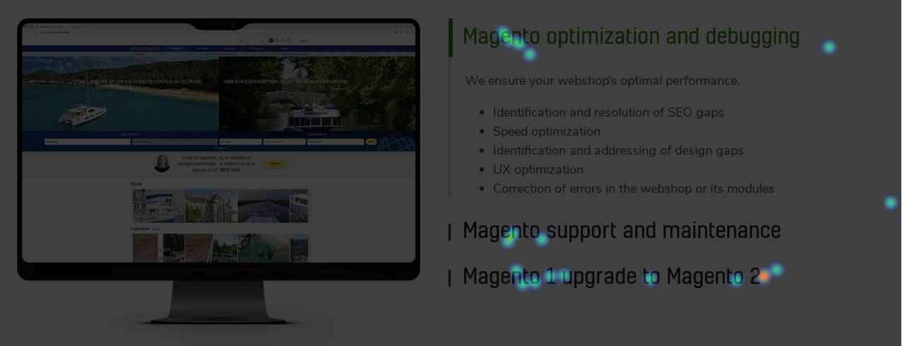
(A Crazy Egg heatmap for our Magento landing page)
In our Magento page, the headline “Magento optimization and debugging” seemed to get clicks a lot despite it not being a link.
This observation lends to different assumptions—that the headline design may look like a link to users, that users are expecting for us to have a dedicated page about the topic, or (since this is in an accordion layout) users might simply be trying to close the tab.
If you’re seeing clicks on a non-clickable element on your page, you may consider re-evaluating the design or capitalizing on the interest and making it a link to a relevant landing page.
Even at a glance, you can already make some assumptions from a heatmap that you can use as a basis for further refining and improving your design and content.
But “assumptions” is a key word here, because as useful as they are, heatmaps are not the gospel—they don’t offer straight facts about your users apart from where they’re clicking or how far they’re scrolling.
For example, heatmaps can’t really tell you if the clicks you got on your “Contact Us” button are from users who were undecided when they first came to your website or from users who visited your page already intending to send you an inquiry—which makes a world of difference to the context of your data.
As such, you should look at your heatmaps as a starting point—a guide for you to make design changes and test them until you achieve the performance goal you’ve set.
A heatmap is a representation of aggregated user data, thus it enables you to see the big picture of which parts of your website page attract users’ attention and which ones get ignored for the most part.
But the big picture is still composed of tiny parts that are worth looking into, so in the next article, we’ll talk about session recordings—where we move away from the aggregate and drill down to see what we can learn from users on the individual level.
Next: Session recordings: looking into actual website user experience »