Understanding screen resolution in the context of responsive design
Published on July 30, 2020
Last modified on March 19, 2024
Published on July 30, 2020
Last modified on March 19, 2024
Estimated reading time: 10 minutes
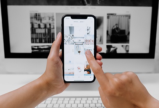
It takes only 0.05 seconds for users to form an opinion about your website, and a large majority of these first impressions are based on your design.
Considering the range of devices and screens that we now use daily, it’s obvious that how your site looks and feels can vary from one user to another.
One key to optimizing for these different experiences is by understanding screen resolution and the role it plays in how your website or webshop will look like in different screens that your customers are using.
In this article, we’ll discuss the basics of screen resolution, responsive design, and why understanding these concepts is critical for your UX and conversion rate optimization.
Screen resolution refers to the number of pixels displayed on a monitor screen. It’s usually expressed as (horizontal pixels) x (vertical pixels).
For example, 1920x1080, the most common desktop screen resolution, means that the screen displays 1920 pixels horizontally and 1080 pixels vertically.
High resolution screens display more pixels (and therefore, more elements in the web page) than lower resolution screens.
Screen resolution is not to be confused with screen size, which just refers to the physical size of the screen (i.e., width x length). Devices with the same screen size may have different resolutions, in the same way that different screen sizes may display the same resolution.
However, size does affect the optimal screen resolution for a device—a smaller screen needs fewer pixels (lower resolution) to properly display elements on a screen, while a larger screen has to be able to display a higher resolution to ensure sharp-looking images and other visual elements.
Different devices come in varying pre-configured settings, which affect how your website or webshop gets displayed in them.
For instance, a mid-range laptop usually has the capability to display 1920x1080 pixels—the same resolution as most standard desktop monitors. However, since a laptop has a smaller screen size, a 1920x1080 resolution will render elements smaller in this display, affecting usability and readability.
To work around this problem, most laptop displays are “zoomed” to a recommended setting that fits the size of the screen, making elements bigger and the text more readable.

In the sample default settings above, the laptop has a 1920x1080 resolution, but is set to a 150% recommended scale so that elements on the screen can be displayed properly relative to the physical screen size (approximately 12.2x7 inches).

(The laptop in the example above)
To know the actual display resolution in this case, you can use the formula:
screen resolution / (scale/100)
So, 1920 horizontal pixels / (150/100)
= 1920 / 1.5 = 1280
And 1080 vertical pixels / (150/100)
= 1080 / 1.5 = 720
In our example, the laptop actually displays 1280 pixels horizontally (i.e., along its width) and 720 pixels vertically (i.e., along its length, without scrolling), scaled at 150% from the original 1920x1080 resolution, because of this configuration setting.
It’s also important to note here that since the original resolution is higher, the zoomed display is also much sharper compared to a screen with a default 1280x720 resolution at 100% because of the density of the pixels.
Here’s the same laptop at 100% scale (notice how the elements in the page are smaller).

Responsive design is the default approach to designing websites today.
A responsive web page basically means that it responds to the device it’s being viewed on and adjusts the layout, placement, and size of the content and elements accordingly so that the page looks good no matter what screen it’s being viewed on.
A standard responsive design implementation enables a web page to automatically scale and fit to the screen it’s being viewed on. This means that whether the page is being viewed on a high- or low-resolution screen, the layout and relative placement of elements in the page will be more or less maintained.
This generally applies to a range of screens with only a few size differences—for example, a desktop and a laptop. However, as you go from big to small (like from a desktop to a smartphone), there are certain points where the page layout has to be adjusted).
For example, a two-column layout may fit just fine in larger screens—but when you start to scale down, the column widths will at one point be too narrow for the content to be viewed properly, which makes it necessary to transform the layout into just one column.

(Sample two-column layout)

(The same page in a smaller mobile screen, transformed into one column)
In responsive design, there are so-called “breakpoints” that mark the point where an update in layout is necessary to maintain great user experience.
Breakpoints are usually considered in terms of desktop, tablet, and mobile resolutions.

In this sample layout for desktop view, the text is relatively big and there is a lot of space for the elements on the page.
As you start to scale down to smaller sizes or lower resolutions, responsive design is needed to ensure that the font size and images also get smaller. This is to maintain the general look of the layout and avoid an interface where the text gets too big for its container and the screen is crowded with too large elements.
Let’s see the desktop layout above in a tablet resolution:

While this sample tablet layout is responsive in the sense that it has scaled down properly to fit the smaller screen size, there are specific issues with it that can affect the user experience (see notes in the screenshot).
At this point, a layout update is needed.

In this sample, the elements have been rearranged a bit—maintaining the general design concept of the original desktop layout, but updated in a way that better fits the device and screen resolution it’s being viewed on.
This is made possible by adding a breakpoint for 768x1024 resolutions and below.
The most ideal breakpoints for your design depend on your site’s content and other elements. Your web designer and developer will have to check how your site looks like when scaled up or down to different resolutions to determine when there is a need to adjust the layout.
As mentioned above, the usual breakpoints considered by designers are:
Desktop
Tablet
Mobile
In some cases, you may even add minor breakpoints where there is no drastic change to the overall layout, but where your designer and/or frontend developer has to adjust minor things such as paddings, margins, or font size for better UI/UX.
Know your users’ top screen resolutions
To better design for your actual users, it helps to know what devices and screen resolutions they’re actually using to view your website. With this information, you can optimize your design for the screen resolution used by most of your visitors. If you have a Google Analytics account, this is fairly easy to find out.
(As of July 2020)
 (Sample Analytics data on top screen resolutions)
Retina is a term coined by Apple for the display resolution of its devices.
In a nutshell, a retina display is double the pixels (horizontally and vertically) so it essentially has four times the pixels of non-retina screens. On top of this, each element is also doubled in size, making it still the same size as in a non-retina display, but much sharper and crisper. (Think of it like a Windows desktop at 200% zoomed display.)
In the context of responsive design, there is no special layout consideration for Retina screens since their displays show the same base resolution as its non-retina counterparts.
Needless to say, it’s not possible to get your website to look 100% the same across different screen resolutions.
But the point of responsive design is not to ensure that your website looks the same always; rather, that it’s optimized for the best look and user experience regardless of device, screen resolutions, and screen sizes.
Here are some important things to consider instead:
Considering that not all users scroll all the way down a web page, make sure that all key information like your value proposition and call-to-action are always visible above-the-fold in different screens, big or small.
Adjust font size and text containers accordingly to optimize for readability, always. According to Google, an ideal column should contain 70 to 80 characters per line, so when a text block grows past this number, consider adding a breakpoint.
Interested in learning more? Contact us today and our project managers will be happy to help you.
AUTHOR

Peter Skouhus
A Danish entrepreneur who owns 1902 Software Development, an IT company in the Philippines where he has lived since 1998. Peter has extensive experience in the business side of IT development, strategic IT management, and sales.