
Estimated reading time: 48 minutes
Learn how speed impacts your business and get practical tips for making your website faster.
Google has been saying that speed matters since 2009. Ten years on, and it matters more than ever as website speed went from being a competitive advantage over other sites in the same industry, to a standard experience expected by the everyday user that could make or break the conversion rate.
Fortunately, making your website load fast is not that difficult. At least, most of the time.
Solutions in the form of speed testing and monitoring tools, website plugins that automate optimization, and several other technologies and techniques are plenty and readily available.
Some speed optimization tricks don’t even require tools, just awareness and action. But where do you start?
In this guide, we explore different topics to help you get started on speeding up your website — or if you’re already past the “beginner” stage, to help you keep the process going.
Note, however, that this is not meant to be an exhaustive list of every single thing you need to know about speed optimization.
For example, while we briefly run through them, we don’t delve too deeply into very technical steps that a person who doesn’t know how to code will be able to do. This is a guide for the typical business owner who wants to take action on the speed of their website, and wants to learn how to do it.
That said, no matter what stage you’re in — whether you’re just taking the first step or at the point where you’ve done the basics and ready to take it further — here are resources for you to:
- Understand how your website speed is affecting your business.
- Learn the important terms and concepts about speed optimization, explained in a non-technical fashion.
- Know the different factors that could be slowing down your site and explore different steps (ranging from simple to a bit more complex) that you can take to speed up.
This series was last updated on July 17, 2019. Best practices on speed optimization are constantly changing, and while we’ll do our best to keep the information here accurate, consider them as current only for the date of the last revision.
How does your website speed impact your business?
The fact that speed is important is not exactly a big revelation.
Even casting aside the statistics and case studies that prove this point, it’s still pretty obvious why speed matters: think back to the last time that you left a web page because it was loading too slow.
It’s not exactly an experience that you want your site visitors aka your potential customers to have, is it?
But knowing that speed is important doesn’t necessarily translate to doing something about it.
For instance, 73% of marketers surveyed by Unbounce in 2018 expressed that improving their page speed is either “somewhat urgent” or “very urgent”. Yet the same survey revealed that only 3% of marketers consider faster website loading times as their top priority for 2019. What gives?
Marketers had other things to prioritize, and the same probably applies to you as a business owner.
With many other pressing matters to attend to, how do you determine exactly how high speed optimization should be on your list of priorities?
The key is to first understand how speed may be affecting your business in the first place.
Speed affects your ranking on search results
Speed matters to Google. Unless you’re not out to get your website as high as it could be on a Google search results page, anything that matters to Google should matter to you.
Google’s co-founder Larry Page expressed a vision of “being able to go from webpage to webpage as quickly as turning the pages of a magazine”, which led to Google’s “Let’s make the web faster” initiative in 2009.
The tech giant has been campaigning for speed ever since: site speed has been a ranking factor for desktop search results since 2010, and in 2018, Google has announced that page speed will be used for mobile search ranking as well.
Aside from being an official ranking factor, page speed also affects your bounce rate, or the percentage of sessions where a user leaves your site after visiting only one page.
The bounce rate is an important indicator of how relevant your site is, which in turn is a factor that Google considers when serving search results.
A low bounce rate tells Google that your site must be relevant enough if users are exploring more pages and not immediately clicking out when they come to your site.
On the other hand, a high bounce rate suggests that users do not find your site content relevant to the query they searched for.
Often, however, it’s not irrelevance that is the issue, but slow loading time.
When a page loads too slow, most people simply hit the back button and look at the next item in the search results. According to Google, as load time goes from 1 second to 3 seconds, the probability of bounce already increases 32%.
But as page load time decreases, the number of pages that users tend to visit in one session also increases—in 2017, for example, users were shown to visit an average of 5.6 pages more when a page load time is 2 seconds compared to 8 seconds.
If your site is too slow, you run the risk of showing up lower (or not showing up at all) in search results.
Google serves the most relevant pages based on a person’s search query, but even the most relevant page will be of no good use to a user who not only wants to get an answer to her question, but wants to get it fast.
Speed affects user experience and conversions
Users don’t like a slow site. In this era of instant gratification, nobody really has the patience to wait for a slow loading site when hundreds of other similar sites can be found on the web.
In fact, an average user will spend more minutes browsing a fast but irrelevant site than wait for a relevant but slow one to load.
Speed is an important factor in the user experience because technically, your user will not be able to experience anything in your site until it loads.
In 2018, Google found that more than half of mobile site visits exit a page when it loads for longer than 3 seconds.
If your site is slow, you’re losing a substantial number of potential visitors. Not only that, but you’re also losing potential conversions.
In Unbounce’s 2019 Page Speed Report, 45.4% of surveyed users said that they are less likely to buy from a site that loads slower than expected.
But even more alarmingly, 36.8% are less likely to return while 11.9% are likely to tell a friend about the experience.
On the other hand, Google reports that consumers are on average 10% more willing to recommend a webshop as load time went from 13 seconds to just 10 seconds—and as load time was further reduced from 13 to 3 seconds, the estimated advocacy from consumers also increased to 26%.
User experience affects how likely your site visitors are going to convert, and this likelihood will only further decrease if your users are leaving your site before they even see what you can offer.
More importantly, good user experience produces loyal customers who will be advocates for your brand. And good user experience starts with a fast loading site.
Speed affects how much you pay for ads
Search ads cost more if you have slow landing pages. If you’re running pay-per-click (PPC) ads on Google, you may be familiar with the Quality Score metric, an estimate on the quality of your ads, keywords, and landing pages. It’s also a determining factor in how much you get charged for each click you get on your ads—basically, the higher your quality score is, the less you have to pay.
Unsurprisingly, page speed is one of the factors that affect how Google determines your quality score.
When someone clicks on your ad and the landing page loads too slow, Google considers it a poor user experience, likely causing the ad’s overall quality score to go down.
As a result, your ads become at risk of showing less often or even not at all, and on top of this, you also pay higher for the clicks that you manage to get. No one likes a lose-lose situation.
Speed affects your operating costs
A slow site is often caused by “unnecessary” resources taking up too much space in the server. Cutting down on these resources not only improves your page loading time, but also helps you cut down on your operating costs.
Generally, hosting plans come with a certain amount of allotted resources—some plans offer fixed costs regardless of how much resources you use up in the server, but most charge an extra or require you to upgrade when your resources exceed a certain amount.
However, the ideal solution is not always to upgrade to a larger server, but simply to remove unnecessary resources in your current one.
This frees up space that lets you stay within your current plan and enables you to handle more traffic to your site without investing in more hardware.
In some cases, this can even let you opt for a lower-priced plan. Either way, the end result is a faster site at a relatively lower operating cost.
Speed affects your site’s indexation
Google and other search engines may crawl your site less if it’s slow.
Google’s crawlers have a so-called “allocated crawl budget”.
This budget is made up of two factors—crawl demand, which is the demand for your pages based on their popularity and the relevance of your content, and crawl rate limit, which limits the “maximum fetching rate” for your site, or the number of pages that the crawlers can “call” simultaneously and the waiting time between such calls.
If your site responds quickly to the fetches, Google’s crawlers are able to crawl more pages. However, if the site loads slow or sends many connection timeouts, the crawl rate limit decreases and Google might stop crawling altogether.
While Google did confirm that this is not a concern for most small websites, if you have a large site with more than a few thousands of pages, too slow loading time may be affecting your site’s indexation.
A slow loading site is not a mere frustration, it’s an issue that can impact your business down to the bottom line.
And while the severity of the impact varies from business to business, it’s no question that website speed is an important aspect of your business that you have to keep an eye on.
It’s also important to remember that speed optimization is not something that you do once and forget for the rest of time.
It’s an ongoing process and therefore should be a constant fixture in your list of priorities. If it’s not, it may be time to change things around.
What you need to know about speed optimization
Now that you understand how your website speed impacts your business, it’s time to understand speed optimization as a concept.
Obviously, it refers to the practice of optimizing your website for speed. But this definition in itself needs some clarifications:
Firstly, what is speed and how is it measured?
Secondly, how do you optimize for it? And is there an acceptable speed to aim for?
The illusion of speed
We all have an idea of what is fast, but when it comes down to it, how many seconds is that?
Speed is a quantifiable metric, but while an exact number is useful for having a specific target to aim for, a single measurement doesn’t really capture all the other factors that go into how fast a user perceives your site to be.
In reality, users don’t count the seconds while a web page is loading.
They visit a page for a reason, like getting information or purchasing a product, so what ultimately matters for them is how quickly they can accomplish what they set out to do in your website — and initial page loading time is only one aspect of that.
Consider an online shopper who goes to a webshop with a clear idea of what they are going to buy.
This user will most likely look for the search bar or the product menu first.
When the page loads the search bar and the user can immediately type the product name and search for it, they will probably perceive the website as “fast” even if technically, the rest of the page’s elements have not loaded yet.
On the other hand, even if the search bar has loaded in a snap but the user cannot use it until the page content has fully loaded (which took several seconds), they will probably perceive it as a “slow” response on the webshop’s part.
This is the illusion of speed, and the ultimate key to it is understanding user perception.
Often, instant feedback is what makes a page appear “fast” to a user.
When a user navigates from one page to another, say, from a Google search results page to another website, the first signal of speed to the user is whether the navigation started successfully, followed by how fast content appears on the page and whether or not they can start to interact (i.e., click, swipe, type) with the elements.
Google found that retail websites that prioritize the loading of above-the-fold content (the area of the screen first visible to a user without further scrolling) are perceived to be faster than the actual measured page speed, likely because the part immediately visible to the user is already available even while the rest of the page (i.e., the part “below the fold”) is still loading.
But it’s not just how quickly (and easily) the user can interact with the page’s elements.
In the same study, Google also explored other factors affecting a user’s perceived speed or performance of a website. Their research revealed that:
- Older users tend to be more relaxed and perceive more websites as fast, regardless of the actual speed. On the other hand, younger users (18-24 years old) are more demanding for fast loading times.
- When users are in an anxious or rushed state, they tend to perceive sites as slower; when they are calm and relaxed, their perceived speed of the site gets faster.
- Perception also depends on the situation—for users who are on the move, sites are perceived to be slower, but for users who are sat down or at home, sites are perceived to be faster.
So while seconds do matter—a page that painstakingly loads for 30 seconds will probably be perceived as slow no matter the situation—also keep in mind that several other external factors affect the user perception of speed.
Ultimately, it’s how the user experiences the time that your page is loading that should bear more weight when you optimize your site.
Metrics for measuring speed
If speed is more than just a single number, how do you effectively measure it? Different factors in speed and perception need different metrics. Here are some of the most commonly used ones by popular speed testing tools.
Page speed – usually refers to either the time it takes for all the content in the page to fully load or the time it takes for the browser to receive the first byte of information from the web server.
DOM ready time – DOM, or Document Object Model, refers to the source of the web page, and includes the page content such as text, images, and other files.
DOM ready time is the amount of time it takes for the complete HTML code to be available to the browser.
DOMContentLoaded – is when all the content from the DOM has been fully loaded by the browser.
Speed index – is the time it takes for content above-the-fold to be displayed.
Different devices have different screen sizes, so the speed index varies depending on the size of the screen where the page is being viewed.
First paint – is when the screen renders anything visually different from the previous screen, like a change in the background color.
First contentful paint – is when the first content appears on the page, like a text, image, or canvas element.
First meaningful paint – is when the first primary useful content is loaded.
Useful could mean different things for different websites—it could be an image if it’s a product page, or a headline and some text for a news article.
First CPU idle – is the point at which the page is minimally interactive, or when the user is first able to engage with the page.
Time to interactive – is the time it takes for content to be visually rendered and usable for the user, like the “search bar” example above.
Time to first byte – is the time it takes for the browser to receive the first “byte” or piece of data from the web server; also what is sometimes referred to when talking about “page speed”.
First input delay – is the time between the first interaction of the user with the page to the time that the browser is able to respond.
It’s quite similar to “time to interactive”, but first input delay measures actual visitor sessions, whereas time to interactive can be measured without any actual users.
Some of these metrics are quite technical, while some are more attuned to user experience. In measuring speed, it’s a good practice to get measurements from a mix of both kinds.
Metrics such as the DOM ready time or Speed index are useful for reporting and keeping track of progress in your optimization process, while the more user-centric performance metrics will help in optimizing with your average user in mind.
For instance, the first meaningful paint will guide you to prioritizing which parts or elements on your webpage should be loaded first, depending on which part of the page is most relevant for your user.
To drill down on the specifics of each metric, and to learn more about other metrics that could be useful for your measurement, check out Google’s official guides:
Optimizing for mobile speed
You probably always hear about crafting an omnichannel experience that involves meeting your customer where they are — in 2019, they are on their phones.
Most businesses already recognize this fact and have adapted a mobile strategy in one way or another. However, mobile presence alone is no longer enough to cater to customers’ evolving expectations.
In 2018, the average loading time for a mobile page was 15 seconds.
This was reported in the same research by Google that revealed that 53% of mobile visits leave a page that loads more than 3 seconds.
Considering the large discrepancy, it’s clear that not nearly enough businesses are taking steps to optimize their mobile sites.
But why do you need to optimize specifically for mobile?
For starters, search results ranking is done differently on mobile and desktop.
We previously mentioned that Google officially made page speed a ranking factor for mobile search results last January 2018. This means that Google specifically looks at your page as it loads on mobile and evaluates it independently from the desktop version of your site.
So even if you are on the top result for a certain keyword on desktop, your ranking may still go down significantly in mobile search if your mobile site is too slow. And if you’re not paying attention to your mobile speed, you may be missing out on potential customers who are primarily using their phones.
Secondly, it all goes back to user expectation.
Smartphones represent easy accessibility and on-the-go connections, so if you think about it, it makes sense that users will expect to have a fast experience on their mobile phones.
In fact, according to a 2017 research by Akamai, only 42% of users expect loading times to be either “a bit slower” or “much slower” on their phones than on desktop.
On the other hand, more than half of the participants expect mobile speed to either be the same as, or faster than desktop loading times.
For businesses, the only thing to do is keep up.
Know what’s slowing down your site
To get to the solution, you first have to know what’s causing the problem.
Ryan, 1902 Software’s project manager for WordPress, often sees clients using very large images on their websites, not knowing that it can affect page speed. “It’s a common thing that people don’t realize is slowing down their site. More often than not, it’s aesthetics over speed.”
“Another common issue that comes up for CMS [content management system] users, especially WordPress, is installing plugins that are meant to be used for a specific page only,” Ryan adds.
“Plugins are by default activated globally [meaning for the whole site], so the plugin’s JavaScript and CSS files get loaded on all pages of the site, regardless of whether the plugin is actually used or needed on these pages or not.”
In turn, the extra JavaScript and CSS affect the loading speed of such pages, while not actually having anything to do with the page’s content or functionalities.
These are just some of the more common issues, and sometimes it’s relatively simple issues like these—issues that stem from the website owner, editor, or marketer being unaware of what to do and what not to do with respect to speed—that are causing the slow loading time of a page.
Other times, the issue may be deeper in the website’s code and needs technical guidance to be resolved.
But the common denominator of these issues is that unless you are aware of them, you will not be able to address them.
What’s causing a slow loading time is not always obvious—if it were, then you would have done something about it by now.
Especially for more complex issues that lie in the code, you may need developers to take a look at your site and determine what’s not working and causing problems.
For “general diagnosis”, though, most speed and performance testing tools offer insights and suggestions on what’s causing your website to load slowly. Here are some that we’ve found useful for our own projects:
1. Lighthouse – This is an auditing tool that can be run as a Chrome extension, or directly within Chrome DevTools (i.e., the set of web developer tools built in the Google Chrome browser that’s usually accessible when you right click and Inspect a web page).
Lighthouse scores a page on different categories: performance, progressive web app, accessibility, best practices, and SEO.
The performance score is based on different metrics: first contentful paint, first meaningful paint, speed index, first CPU idle, time to interactive, and estimated input latency.
Aside from the score, Lighthouse also points out possible causes of your page’s slowdown, and provides actionable suggestions for improving page performance and corresponding savings on load time.
2. Page speed insights – This provides insights on your page speed for both desktop and mobile.
Page speed insights largely uses Lighthouse data for testing speed, and therefore reports the same metrics that Lighthouse uses.
It’s worth noting, however, that Page speed insights and Lighthouse (accesed from within Chrome DevTools) can sometimes produce different results. [This is our observation from our own tests, but generally, the results should be within the same range.]
Aside from the lab data analyzed by Lighthouse, it also presents real world user experience data from CrUX when available for the site.
3. WebPageTest – This lets you simulate how your page loads in a specific location and browser, so this is especially ideal for businesses with customers coming from different regions in order to get a better overview of how your pages load for your target users.
Aside from the location, WebPageTest also lets you select the browser and many other advanced settings that will help you further analyze your website’s performance.
4. GTmetrix – GTmetrix is a suite of different features that focus on improving web performance, and comes in both a free and paid version.
It analyzes a web page based on indicators set by Google and Yahoo, and reports different metrics such as page load time, page size, and number of requests.
GTmetrix also lets you playback videos of page loads for a closer look at possible loading issues or a frame-by-frame view of real-time page load.
There’s also an option to set up automated monitoring of pages and notifications for different conditions that indicate poor page performance, like too slow loading time or a significant increase in total page size.
5. Pingdom – Much like GTmetrix, Pingdom offers different features for monitoring your website’s speed and performance.
They have a speed testing tool that lets you test the loading time from a specific location, and the pro solution even provides a feature to monitor actual users that visit your site.
This helps in identifying real world bottlenecks that users may be experiencing when your site is loading.
Like any undertaking, speed optimization will be most efficient when you first understand what you’re working with (e.g., your current speed, the resources and elements that you need and have, etc.), and get to the root of what the likely causes are for your slow loading time.
How to speed up your website
The path to a faster site is not a straight line.
Speed optimization is not a one-time task, so there are some practices that you need to go back to over and over to ensure that you’re keeping up.
Some you may even completely skip over because ultimately, every website has different types of content and different issues that need to be optimized.
Once you have tested your site speed and have a clear direction, or at least an idea on what’s slowing down your site, here are different techniques for improving your speed, in order of the easiest to the hardest implementation:
Start with your images and other graphic assets
We all want a visually appealing site design to entice customers, and powerful images are usually the best way to achieve this. However, these images will not be of much use if users can’t actually see them because they take too long to load.
Besides, today’s consumers care more about speed than visuals.
According to Unbounce’s survey, a significant number of users are willing to give up animations (56.6%), videos (52.8%), and photos (24.1%) in a page if it means that it will make the page load much faster.
Very large images are always cited as the “biggest culprits” of slow pages, so what can you do with them?
Tip #1: Remove anything unnecessary.
“The most optimized image is the non-existing image,” says Google in their mobile speed optimization guide.
The first thing you have to consider is whether all the fancy images and videos placed on your site are actually necessary.
If the message represented by these assets can just as well be done with some creativity through CSS (or cascading style sheets—a language used to define styles, shapes, and effects), then it’s probably better to completely remove such images and reduce the weight of your pages.
Tip #2: Compress images.
Make sure that the images and videos you upload into your site are rendered in the actual size that they’re taking up within a page.
Also remember to compress images by running them through tools like TinyPNG.com. Compressing your images significantly reduces their file size while at the same time still preserves their quality.
Tip #3: Use the correct format.
Google suggests that images should be in WebP, an image format that is at 30% more compression than the usual JPEG. For photos with transparent backgrounds, use PNG; for scalable icons and shapes, use SVG.
Step into your user’s shoes.
We previously discussed how users sometimes perceive pages as faster than their actual speed because of different factors, including the relevance of the content that first loads and the page’s interactivity.
Use this illusion of speed to your advantage by optimizing your site specifically for your target user, and not according to a generic goal.
To be clear, there’s nothing wrong with having concrete goals like a target load time or page weight.
However, load time will never be standard across every type of user accessing your site — some of them may have the fastest connections, but some may be browsing under poor network conditions.
Optimizing your site with the user in mind will help you optimize for at least some of these real-world bottlenecks as well.
Tip #4: Prioritize loading above-the-fold content.
While it’s ideal that all content in your page loads fast, it’s more important to ensure that above-the-fold content loads faster.
Consider using the “lazy loading” technique, where images are loaded only when the user scrolls or enters the area where they are placed. This makes your page appear to load faster, because elements are only rendered as needed.
Tip #5: Make sure your content is immediately interactive.
Visually loaded content may not be that useful for a user if they cannot engage or interact with it right away.
Most of the time, the culprit behind the non-interactivity of visible elements are render-blocking JavaScript and CSS. Basically, these are tasks that keep the browser busy, making it unresponsive to any user input or interaction.
Ask your developer to remove or at least defer the loading of these render-blocking resources to improve your time to interactive.
Tip #6: Display placeholders while your assets are still loading.
When a user leaves a web page because it’s “too slow”, it’s usually because there’s nothing happening during the loading time to keep the user engaged—like having only a blank white page displayed on the screen.
However, even when a page loads slowly but still displays some feedback to the user, the user is likely more willing to wait because of a visible signal that something is happening.
Facebook, for instance, uses placeholders while it loads posts on the news feed. These are what appears to be the bare skeleton of a post consisted of shapes standing in for the elements like the profile picture, name, and the post itself, until the actual content is loaded.
Tip #7: Decrease tap or click delay.
The perception of speed is not limited to the initial loading time.
Even if your page did load quickly, the user will leave with a bad experience if elements are not readily interactive (as dicussed above) and if there’s too much delay after a click or tap.
Google recommends that the traditional 300-350ms delay between touchend and click should be eliminated to enable a faster interaction for the user.
Tip #8: Make use of optimistic actions.
Optimistic actions send instant feedback to the user that make it seem like an operation is complete when in reality, the server is still processing it in the background.
A good example of this is Instagram’s like/heart action on its app—when a user double taps a photo, a heart is immediately displayed to the user even while the action has not been fully processed yet on Instagram’s end. Or messaging apps where the message appears to be “sent” right away (i.e., the message leaves the text field and goes into the chat box) when it’s actually still sending.
Consider the instances when you yourself left a page because it was loading too slow versus the times that you waited for a page that didn’t load in a snap. Those pages may have more or less the same load times in terms of seconds, but the difference is probably that the latter group kept you engaged enough with consistent feedback.
Again, it’s ultimately how your users experience your site that defines their impression of how fast or slow it is. Optimizing for user-centric metrics is a win-win, really—you get to “selectively” optimize your site, but do it in a way that actually caters to your users’ needs and expectations better.
Other techniques
Aside from these two main focus areas, here are other speed optimization techniques you can implement fairly easily:
Tip #9: Leverage browser caching.
When a user visits your site for the first time, the browser needs to download all the content for it to properly display the page, including the HTML, JavaScript, CSS, and images.
The browser can save or “cache” these elements locally so that when the user returns, it won’t need to re-download all the files again, thereby decreasing the loading time.
Leverage this feature by marking your pages or specific elements within your pages with your desired interval at which the browser has to update or re-download such elements.
Basically, you tell the browser that some elements on your page are not likely to be updated regularly so it can cache these elements for a longer period, lessening the resources that it has to re-download every time a user returns to your site.
Tip #10: Use a Content Delivery Network (CDN).
A CDN is a network of servers strategically located in different locations around the world. It acts as a “connector” between the user and the origin server of your website and greatly helps with improving your page speed by:
- Being closer to where your users are – the distance from the user to your web server can affect page speed. With a CDN, the user’s browser can send a request from the nearest server to its location instead of directly from your main server.
- Taking some of the load off your main server, so to speak – multiple requests can slow down your main server. If you have a CDN, the requests can be directed to these servers instead and lessen the load that the main server needs to handle. On top of this, it also helps you reduce hosting costs by reducing the data that the main server needs to provide through caching content.
Our project managers recommend Cloudflare and StackPath (previously MaxCDN).
Tip #11: Remove unused or unnecessary plugins.
With many things to maintain on a website, deactivated or unused plugins can pile up and weigh down your site.
Check if all the plugins you currently have installed are ones you are still using and remove unnecessary ones to reduce your page weight.
Tip #12: Upgrade to the latest version.
If you’re using a CMS (like WordPress or Umbraco) or an ecommerce platform (like Magento), simply upgrading to the latest version can help improve your page speed.
Of course, it’s not always the case that upgrading is the best option, especially for very new version releases that are still unstable.
However, it’s good to stay on top of latest updates in your CMS to take advantage of any new features and improvements that they bring, not to mention the new security patches that will help protect your site better.
Tip #13: Upgrade to a larger server.
Removing, minifying, and compressing resources can only do so much. If your site is growing and you’re getting more traffic, it may be time to upgrade or scale up to a larger server. You may want to consult your developer on this, however, as scaling up to a larger server is not something to be taken lightly.
More techniques for your development team
Marcelo, one of our Magento project managers, says that merging JS and CSS files is a relatively simple speed optimization trick that could make a big difference in a page’s loading time. To be fair, however, it’s a relatively simple trick for a developer, but not so much for a non-technical person.
Here are some more tips that you could check with your development team:
Tip #14: Minify resources (CSS, JS, and HTML)
by “cleaning up” the code, i.e., removing extra spaces, commas, or other unnecessary characters as well as formatting and unused code.
Tip #15: Enable compression
of CSS, JS, and HTML files that are larger than 150 bytes using gzip.
Tip #16: Reduce redirects
to reduce additional wait time for HTTP requests.
Accelerated Mobile Pages (AMP)
AMP is an open source framework spearheaded by Google in its effort to push for a better mobile web experience. AMP consists of web pages that provide near instantaneous loading experience on mobile, with components that come already optimized for performance.
AMP is generally leaner because of the strict rules that it enforces.
For instance, it doesn’t allow the use of any JavaScript and select HTML elements. While this may seem limiting for some websites, these restrictions are what ultimately makes AMP faster than non-AMP pages.
On top of this, AMP also offers a CDN component. By default, it fetches and caches AMP content so that it can be served faster.
(To learn more about AMP, visit the official website.)
Despite the benefits that AMP offers, not many online businesses have implemented it for themselves.
Only 12% of marketers surveyed by Unbounce claim to have a strong understanding of AMP, with the rest having only limited understanding or no knowledge about AMP at all.
When asked why they’re not adapting AMP, the main reasons that surfaced are either the lack of understanding of the technology or the lack of developer capacity to implement it.
If this applies to your business, you can start adapting AMP by using tools like Unbounce, which lets you create AMP landing pages easily. This can ease you into the idea, and is a good way for you to see the benefits of AMP for yourself.
However, for a complete implementation of AMP on your entire site, you do need a dedicated development team to help you.
Our in-house development team have done many AMP projects—in fact, our own mobile site used to be built with AMP before we switched to a headless CMS setup (more on this in the next sections).
Progressive Web App (PWA)
PWA has been around since 2015, but recently it’s emerging as a new trend in mobile optimization because of the fast experience it delivers to users.
It’s basically a web app that’s accessible through a browser just like any other website, but acts as a native mobile app in terms of loading speed, navigation, and interactions.
PWA also gives you the option to make your site “installable” by offering an “Add to home screen” button to users when they visit your site, and even enable push notifications to re-engage with your users. These are optional features if you want your site to be more “app-like”.
But outside of these features, the key point of a PWA is to improve site performance and enable accessibility regardless of connectivity. A PWA that’s added to the home screen can be accessed on very low-quality networks or even offline.
You can check out PWA stats to learn more about real-world case studies on the benefits of PWA.
Static site generators
Traditionally, this is what happens behind the scenes when a user visits a page in your site: the user makes a “request” by either clicking on a link to your page, or directly inputting your page’s URL in the browser. The request goes to your web server, which then builds an HTML page out of the content in your database, then serves such HTML page to the browser where your user can view and interact with it.
Static site generators, on the other hand, does the “building of HTML page” part before the user even requests for it, making the page readily available when the user actually does.
There are many site generators available for use today, the most popular of which are Hugo, Jekyll, and Gatsby.
We’ll focus on discussing Gatsby but you can also check out these other options to learn more.
Gatsby
Gatsby is a free and open source static site generator built on React, a JavaScript library for building user interfaces in applications.
React is known for building fast and performant sites, but it’s also known to present a problem for SEO.
Since it renders content in JavaScript, Google and other search engine crawlers are not always able to read the actual content as it would a normal HTML page. (Think: tags like title and meta description may not be read by crawlers and therefore affect your site’s indexing and search results ranking.)
Gatsby acts as a happy medium by providing the same performance benefits of React, but also eliminating the issue that it presents with indexing.
Basically, Gatsby uses React to create “components” (i.e., the building blocks that compose the sections of a React page) from your data, then builds static HTML/CSS/JS files from such components, allowing your page to be “readable” by crawlers.
Gatsby has only been around for about four years, and even then it only started gaining popularity in the past year or so.
Now it’s a new buzzword in web development because of how websites built using Gatsby are always blisteringly fast. Here’s why:
1. Gatsby pre-builds HTML pages then serves them in one go when a user makes a request, skipping the part where the web server has to read the database and only then build the HTML out of the data provided.
Think of it as a ready-made fast food order served right away compared to a restaurant meal that has to be prepared from scratch—except with Gatsby, it’s the same “food” but delivered faster.
2. It’s not only the initial page loading that’s fast, but subsequent page navigation as well.
Once you visit a page in a Gatsby site, it also starts to pre-load the other pages in the background, making the overall user experience smoother with switching from page to page done in a snap.
3. Performance is built-in to the Gatsby framework.
In fact, most of the little tips we’ve mentioned above are already done automatically by Gatsby—take it from Gatsby’s founder Kyle Mathews himself, who said he designed Gatsby “with the goal that when using it, it’d be really, really hard to build a slow site.”
On its own, Gatsby doesn’t have an interface for managing content.
Instead, what it does is build pages based on data pulled from another source where content is initially entered and managed, like content management systems (CMS), product information management (PIM) systems, markdown files, CSV, JSON, databases, APIs, and the list goes on.
In fact, you could even have your data in a simple Excel file and publish it as a website using Gatsby.
Of course, there are configurations to be set up and the actual user interface to be designed, but the general idea is that Gatsby can pull data from anywhere and help you deliver it quickly to your users.
Using headless CMS with Gatsby
Since Gatsby in itself doesn’t have a “backend” to speak of, or a place where you can add and edit your data, you can consider using a “headless” CMS to do the job.
In a nutshell, a headless CMS strips away the frontend layer of your site (i.e., the “head”) and leaves only the backend technology (hence the term “headless”).
This is as opposed to how a CMS is usually set up—where the system provides a platform for managing your content (i.e., the backend) and handles how that content is displayed to your end users (i.e., the frontend).
When you go the headless route, you are essentially using the CMS only as a place where you manage and edit your content, but the publishing is done through a different service or platform—in this case, site generators like Gatsby.
Most popular CMS like WordPress and Umbraco can be “converted” to headless, so to speak, and use it along with Gatsby by developing an Application Programming Interface (API) that integrates the backend to Gatsby.
This sort of “re-routes” the publishing of the data so that instead of it being delivered by the frontend component of the CMS, it’s instead sent to Gatsby, which will then work its magic to deliver the content in a snap.
(Umbraco Heartcore is Umbraco’s headless version. For WordPress, there are website plugins like this one that helps convert it to a headless CMS.)
Aside from this, there are also CMS options that are headless at the outset—they’re built without a frontend and are designed to easily integrate with static site generators and other publishers without the additional development that turning a traditional CMS to headless requires. Some examples are Contentful, Storyblok, Butter CMS, and Contentstack.
Aside from all the performance benefits, using Gatsby and/or a headless CMS also provides an extra layer of security for your data due to the HTML pages of the frontend being distinct from your data in the backend.
If you are an omnichannel brand, headless also makes it easier to publish to any platforms by using only one CMS to deliver content not just to your website, but to other platforms as well such as mobile apps, smart watches, and Internet of Things (IoT).
On the other hand, Gatsby makes it easier to publish data from any data sources you may have aside from your CMS.
Mak, one of our project managers for Umbraco, had only good things to say about his experience using Gatsby and headless Umbraco. “[The main benefit is that] you can spend your development time on more important things and not worry too much about performance, as Gatsby will take care of it for you. Also, since Gatsby is built with React, there’s a ton of tools and an extensive library available for us developers to use, as well as a huge support from the community.”
Now Gatsby is great and all, but you’re probably wondering how much development time it will cost.
For websites built from scratch, Mak has observed that the project duration is similar to projects built using traditional CMS—considering, of course, that your developer already has experience with using React and/or Gatsby and doesn’t have to learn the system and technology first.
However, when turning an existing CMS-based site to Gatsby, many factors come at play that make it difficult to provide an exact time estimate.
“The first thing to consider is whether the CMS [the client] is currently using can be turned, because if not, the only thing we can use is the frontend, and only then use it as a reference. It will be like basically starting from scratch,” Mak says. “Another factor is the complexity of the frontend features. It all really depends on each site and how it’s customized.”
Going the headless + Gatsby route is something that you will need a dedicated development team for, and the implementation is for sure not something that can be done in a snap. Again, depending on your website, it may well be a full-blown development project.
Still, this option is worth considering for all the performance benefits that it could bring to your site.
Maintaining speed
As we have mentioned several times, speed optimization should not be a one-time project.
Practices such as compressing and optimizing your images or minifying resources have to be done consistently, especially if your site gets updated quite often, to make sure that your optimized page load time don’t regress.
The most efficient way to maintain speed is by setting a performance budget.
A performance budget is a set of target metrics that you want your site to consistently stay within the range of. This online tool lets you calculate a performance budget based on your goal of page load time on a specific connection.
For example, setting a goal of 3 seconds load time in a fast 3G connection gives you a budget of 600KB.
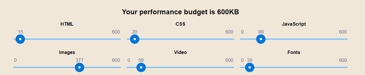
This is the maximum weight you can allot for your page.
It also provides a breakdown of commonly used elements and the corresponding kilobytes you can allot for them. You can toggle these allocations to adjust which elements you want to assign more resources for.
Of course, a performance budget can only work when you follow it.
When you want to add an element to your page that will likely result to you going over the budget, you can either: a) remove an existing element to make way for the one you want to add, b) not add the new element at all, or c) adjust your performance budget, but be prepared for any consequences it may have on your page speed.
Ultimately, a performance budget is still a guide and not a strict rule.
It simply serves as a reference, but a good strategy will not come out of rejecting any site improvements just because it doesn’t fit the budget.
Speed optimization as a practice is constantly evolving. Many new factors will inevitably emerge in the future, and even user perception and expectation will not always be the same as it is today. A good partner in web development will help you stay on top of these many changes, while also making sure that you’re actually keeping up.
If you’re suffering from a slow website, or even just want to make sure that your load time stays as fast as it could for your users, contact us and we will be happy to provide a solution for you.